Justice 40
EJSCREEN PLATFORM EXPLORATIONS
There are significant — maybe even irreconcilable — flaws in both the existing and emerging tools to prioritize and monitor Federal funding for environmental justice. The flaws are constitutional in the technology, methodology, and data collection, leading to geographic bias, misrepresented human impacts, and even cybersecurity weak points.
This prototype is an evolving exploration aimed at improving the access, delivery and dissemination of such data.
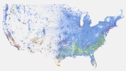
PM 2.5 refers to a category of fine particulate pollutant that is 2.5 microns or smaller in size. Increased negative health effects are reported when higher quantities of PM 2.5 are present, including increased incidence of respiratory disease and cardiovascular effects.
Zoom in to explore
view by PM2.5 index score
Toxic, or hazardous, air pollutants include a variety of gases, compounds and elements, such as hydrogen chloride, benzene, asbestos, or mercury, among others. Toxic air is known or suspected to cause cancer or other serious health effects, such as reproductive or birth defects, or adverse environmental effects.
Zoom in to explore
view by Air toxics index score
Ground level ozone, is not emitted directly into the air, but is created by chemical reactions when pollutants are emitted by cars, power plants, industry and chemical reaction. When inhaled, it reacts chemically with many biological molecules in the respiratory tract, leading to a number of adverse health effects
Zoom in to explore
view by Ozone index score
More frequent, extreme rainfall is projected; it may result in more floods, of greater intensity and various types. Flooding has extensive and significant effects on health, spanning the short and long terms and ranging from drowning and injuries to infectious diseases and mental-health problems.
Zoom in to explore
view by Flood index score
EJ Score - Under development.
Zoom in to explore
view by E Score
HUD
Zoom in to explore
view by HUD
About THE RACIAL DOT MAP
This racial dot map is an American snapshot; it provides an accessible visualization of geographic distribution, population density, and racial diversity of the American people in every neighborhood in the entire country. The map displays 308,745,538 dots, one for each person residing in the United States at the location they were counted during the 2010 Census. Each dot is color-coded by the individual’s race and ethnicity. The map is presented in both black and white and full color versions. In the color version, each dot is color-coded by race.